Corrections to the company logo

  • Status: Closed
  • Prize: $80
  • Entries Received: 12
  • Winner: atikur2011

Contest Brief

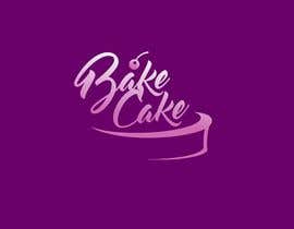
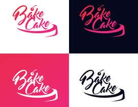
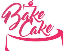
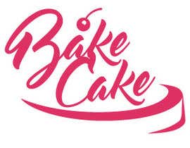
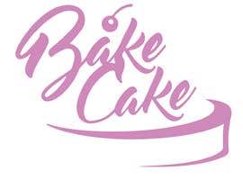
1- Over time, there was a feeling of lack of recognition in the lower part of the logo of the rounded contour à la biscuit /cake/confectionery, which characterizes the focus of the BakeCake logo. We are talking about finalizing the extreme right stroke associated with the shadowing from the fillet, so as to save this idea and at the same time achieve the desired effect.
One more technical aspect arose regarding this stroke. During the manufacture of a logo billboard, its connection with the main part is subtle, and there is a high risk of breakage in this place. Perhaps when finalizing the stroke, and you can also take this moment into account somehow (of course, not to the detriment of the original idea).

ATTENTION
The stroke we are talking about is marked with a blue oval on the attached png file.

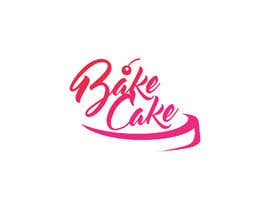
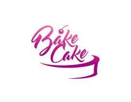
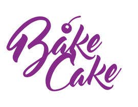
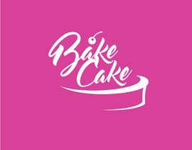
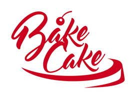
2- Also, there is a desire for colour correction - we want to get closer from shades of pink to shades of cherry.

In attachment, you will find the logo in AI version. Please contact if you need any additional information. The logo should be corrected in vector and submitted at the end of contest in eps and ai formats.
All rights for the logo are copywritten and reserved.

Recommended Skills

Employer Feedback

“It was a pleasure to work with this peson and hope to make more projects with him.”

Profile image Bodrij, United Kingdom.

Top entries from this contest

View More Entries

Public Clarification Board

  • RAKIBUL321
    RAKIBUL321
    • 4 years ago

    please check #93,#94,#95,#97,#118,#119 ..any type of change available if you want .

    • 4 years ago
  • jafirbukhari512
    jafirbukhari512
    • 4 years ago

    hahahahahahahaha

    • 4 years ago
  • RAKIBUL321
    RAKIBUL321
    • 4 years ago

    dear contest holder ,,check my all entries.

    • 4 years ago
  • RAKIBUL321
    RAKIBUL321
    • 4 years ago

    dear contest holder .please check #117 to #135 all entry

    • 4 years ago
  • vairam28895
    vairam28895
    • 4 years ago

    Hi sir can u please clarify what you need Exactly

    • 4 years ago
  • shrahman089
    shrahman089
    • 4 years ago

    Hi There, Please check my design #58 Thank you

    • 4 years ago
  • gabibaba2000
    gabibaba2000
    • 4 years ago

    I don't understant what you need and why you rejected my entry #38

    • 4 years ago
  • osiur120
    osiur120
    • 4 years ago

    PLEASE CHECK#43

    • 4 years ago
  • osiur120
    osiur120
    • 4 years ago

    PLEASE CHECK#42

    • 4 years ago
  • osiur120
    osiur120
    • 4 years ago

    PLEASE CHECK#41

    • 4 years ago
  • saimajanjua
    saimajanjua
    • 4 years ago

    Hello,
    Do you want that mentioned part removed from logo or want changes
    so it can be better when used on boards etc, please share a few more details, thanks

    • 4 years ago

Show more comments

How to get started with contests

  • Post your contest

    Post Your Contest Quick and easy

  • Get tons of entries

    Get Tons of Entries From around the world

  • Award the best entry

    Award the best entry Download the files - Easy!

Post a Contest Now or Join us Today!