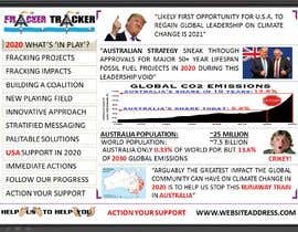
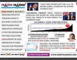
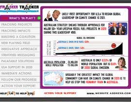
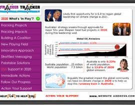
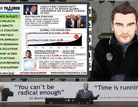
Graphic Presentation to support Video
- Status: Closed
- Prize: $59
- Entries Received: 17
- Winner: Toonee
Contest Brief
***I have also included feedback to Entry 1 which may help others submitting their work to understand what i am looking for. see entry1.png + comments in feedback section***
The quickest way to understand what I am looking for is to open the file "Placement of TV Graphics.png" (attached). The content inside the TV is roughly how I envisage your work will look.
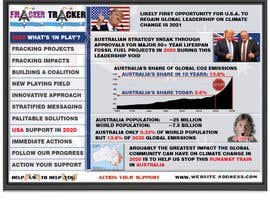
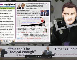
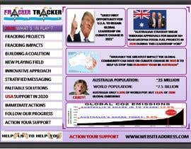
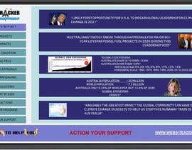
I am looking for a graphic designer to create a framework to display information to the viewer while they are watching a video of a person talking. The graphic presentation is to serve the purpose of highlighting the key points the person is making and will come up on the tv content you will design as the person is discussing these issues. I have created a mock up of what i am looking for. The key elements are as follows:
1. A TV Screen (provided)
2. An overall design including the following components:
(a) A navigation menu (1/3 of screen) detailing the current topic being discussed. This is to be visable throughout the presentation with some moving indicator of where the presentation is currently at (i have used green outline, but you are free to design asd you see fit)
(b) A detail section (2/3 of screen) which presents the key points relating to each topic in the navigation menu. For this sample project, there are 5 key points (texts and graphics) to be designed/laid out.
(c) a footer that stays in place throughout the presentation
I have provided all necessary images and text.
I am looking for simplicity and clarity. The left side of your work with let the viewer know where they are in the presentation, and the topic that is currently being discussed and the other topics that will be discussed. The right side of the screen will provide detailed points on the current topic.
I have used the Copperplate font in this mock up because it is narrow and easy to read. You can use whatever font you like, but the objective is to make this simple to read and to fit into the limited space available. The larger the text can be within the space constraints is preferable.
Feel free to use font color to achieve the same objectives
Feel free to modify the design elements (eg the framework) to best achieve these objectives (simple to read,/follow).
The end result will be a TV with the information provided in the mock up, that will be inserted into a video.
I will work with the successful competition winner to develop the other screens once the design framework is established.
Recommended Skills
Top entries from this contest
-
Toonee Vietnam
-
Crivitol India
-
sithalchordia India
-
nehasaeed4 Pakistan
-
sithalchordia India
-
sithalchordia India
-
emmanuelsinu India
-
emmanuelsinu India
-
bastola479 Nepal
Public Clarification Board
How to get started with contests
-

Post Your Contest Quick and easy
-

Get Tons of Entries From around the world
-

Award the best entry Download the files - Easy!

