JBTKD

  • Status: Closed
  • Prize: $50
  • Entries Received: 67
  • Winner: alfianrismawan

Contest Brief

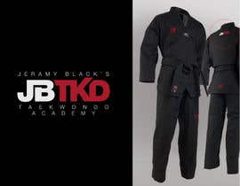
We are in need of a new logo for our martial arts academy that was est. 2000. Our academy name is Jeramy Black's TaeKwonDo Academy. We probably want to go with a letter based design (JB standing for our name and TKD abbr. for TaeKwonDo). Our website is also JBTKD.com so it will be cohesive. Probably some separation in the JB and TKD rather than written together as JBTKD. We DO NOT want any typical martial arts images in it such as kicks, temples, swords, mascots, etc. That is overdone and we want fresh and new. We want the logo to be recognizable even without our academy name listed under it so we need an aesthetically pleasing image that is letter based. We wear black uniforms with gold monogramming and will add this logo to a new patch for the uniform, so no neon or pastels. We like silver, gold, black, red, and royal blue. Bold, simple, and clean is what we want so we can easily monogram it on apparel and it be legible. We are a family friendly academy with the majority of students being juniors so it needs to be non-intimidating to appeal to the parents and adult students alike. No cartoony looks at all. When looking at logo examples, we tend to choose symetrical logos but may be open to others. With so many logos going from business names to iconic symbols/images, this is what we want. This logo will be the base of a complete image update at our academy so I will hire the specific freelance artist I choose to design business cards, letterhead, uniform patches, etc. after the initial design. Thanks and I look forward to seeing your ideas! Please see our website at jbtkd.com for current image logos, images, patches.

Recommended Skills

Employer Feedback

“This designer gave us exactly the type of business logo we wanted. His design stood out among the 50+ we received. He was very easy to communicate with and was quick to get back to us and make the revisions we requested. I would highly recommend this designer and would definitely hire him again in the future. ”

Profile image sblacktkd, United States.

Public Clarification Board

  • alfianrismawan
    alfianrismawan
    • 9 years ago

    Please read my comment on #61 thank you. :)

    • 9 years ago
  • PortalGenesis
    PortalGenesis
    • 9 years ago

    Hi, I uploaded several variations of our design. Please have a look at #58 ; we can adjust as necessary.

    • 9 years ago
  • sblacktkd
    Contest Holder
    • 9 years ago

    Sorry for the delay in response. The submissions that we find the most appealing are 47,48, and 23. We like these because the letters can be stand alone or written with the business name and the JBTKD is connected and fluid rather than just separate letters. Many of the design are very appealing and clean, just too formal for what we need in the fitness industry. We like the heavier, bold lettering and cleanliness of the ones listed above. We like the connected letters of 49 but need a less contemporary version. I am afraid this one will date too quickly for us and we don't want to change again any time soon. Thanks and I look forward to seeing the progress by tomorrow. We have seen several designs that we like as a stand alone design rather than a logo and may make offers to some of you to purchase as a t-shirt design.

    • 9 years ago
  • sblacktkd
    Contest Holder
    • 9 years ago

    NathanNi-Like the concept but we have a local construction company that has the same initials and very close to this logo.

    • 9 years ago
    1. NathanNi
      NathanNi
      • 9 years ago

      Also please see entry #42 , this entry is a middle ground between the two previous. Thank you.

      • 9 years ago
    2. IZABS
      IZABS
      • 9 years ago

      Please see entry #32

      • 9 years ago
  • ZachNi
    ZachNi
    • 9 years ago

    Please check entry 38, We can also lose the "'s" if its something you do not like.

    • 9 years ago
  • IZABS
    IZABS
    • 9 years ago

    Hi i upload my entry. Please check #32

    • 9 years ago
  • sblacktkd
    Contest Holder
    • 9 years ago

    Acaluvneca-Like the idea of the TKD being connected but in a different type of lettering that was more obvious K. Don't care for the orange if edit could be a different color (could be gold but appears orange on my screen).

    • 9 years ago
    1. Acaluvneca
      Acaluvneca
      • 9 years ago

      Thanks very much for rate..please check #22

      • 9 years ago
  • korneliusdesigns
    korneliusdesigns
    • 9 years ago

    Submitted another study, #23 . my previous was #3 . Thanks.

    • 9 years ago
  • chuafb
    chuafb
    • 9 years ago

    Good day!pelase do check #20 thank you

    • 9 years ago
  • sblacktkd
    Contest Holder
    • 9 years ago

    MatiasDC-Really like the color scheme,can i see a black and gold version with white background also?

    • 9 years ago
    1. MatiasDC
      MatiasDC
      • 9 years ago

      sure!

      • 9 years ago
    2. MatiasDC
      MatiasDC
      • 9 years ago

      i've uploaded in #17 a golden and black variant

      • 9 years ago
  • sblacktkd
    Contest Holder
    • 9 years ago

    Virgoxblue - thanks for the color variations, the design is a little more plain than we like. I'd like to see a design that took a different direction than those shown as most are looking so similar.

    • 9 years ago
  • sblacktkd
    Contest Holder
    • 9 years ago

    Virgoxblue-nice design for a tshirt but with the colored background and the shaded letters, would be hard to embroider this as a logo.

    • 9 years ago
  • gdougniday
    gdougniday
    • 9 years ago

    thank you for you quick response regarding the design. I was putting this together based on your brief as well as the fact that your uniforms were black with gold trim. I was under the impression that it was a patch or was to be considered for a patch. I will take your feedback and submit something more along that. Thanks.

    • 9 years ago
  • sblacktkd
    Contest Holder
    • 9 years ago

    Thank you for your fast response-we want something more bold, heavier letters and bigger and brighter. Like the symmetry but doesn't have to have a box around it.

    • 9 years ago

Show more comments

How to get started with contests

  • Post your contest

    Post Your Contest Quick and easy

  • Get tons of entries

    Get Tons of Entries From around the world

  • Award the best entry

    Award the best entry Download the files - Easy!

Post a Contest Now or Join us Today!