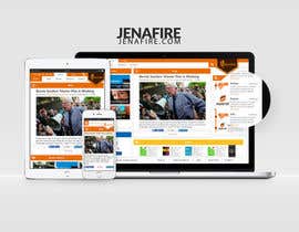
Website mockup Design
- Status: Closed
- Prize: $90
- Entries Received: 23
- Winner: miniikas

Contest Brief
I've had such a positive experience here on Freelancer, I'm back for another project!! I had an amazing logo designed by a talented Freelancer and I need a website designed around the logo. Your creative design genius is much appreciated!
Jenafire.com is a dynamic, energetic website (not yet created) where we will present and discuss hot button social issues.
Please see logo attached.
This contest consist of two parts:
1) Design/ mockup of the site
2) A price to develop the site
Elements of the site:
- Blog - this is the primary focus and should take up the largest part of the screen (will eventually become section for live podcast).
- Facebook Feed
- Smaller section for Books being promoted
- Section for Press Releases
- Separate section for recent blog articles
- Fresh and sleek, exciting and engaging
- *** little to NO scrolling on the homepage. I want all the main feature sections of the site to be visible without scrolling on the home page. If necessary, clickable links are acceptable (to see full views of the sections on other pages of the site).
- Colors that compliment the logo (red, orange and yellow) are definitely preferred as the site will essentially be built around the logo, but I'm open to your own creative vision. I generally shy away from dark colored websites but I'm open to your artistic insights.
- Visually interesting - vary the size and orientation of the sections. not too much symmetry, not too boxy and square looking.
- Smaller banner where logo will be placed
- Mobile version design
- Easily managed by someone who has little experience with websites
Please submit bid to develop the site along with your entry. Thank you!
Recommended Skills
Employer Feedback
“Excellent freelancer! As usual, an outstanding experience on Freelancer.com!”
![]() jemiller1973, United States.
jemiller1973, United States.
Public Clarification Board
-

Contest Holder - 8 years ago
I want to thank everyone for all your hard work and your submissions. There were quite a few great submissions and it was terribly hard to choose only one. I wish every one of you all the best in your endeavors!
- 8 years ago
-

miniikas
- 8 years ago
Hi good afternoon, sorry for not responding yesterday, there was a power outage in my neighborhood, I just respond skype. a greeting
- 8 years ago
-

weaker87
- 8 years ago
I sent you another design on #23
- 8 years ago
-

ancineha
- 8 years ago
please check #22
- 8 years ago
-

ARANWER104
- 8 years ago
Hello again, I am designing another mockup with rectangle shape, But i want to share some very important Information with you related to your design that will help you a lot to decide and choose the best user interface for your upcoming website. actually i have researched something and want you to see it. Please inbox me here.
- 8 years ago
View 1 more message
-
ARANWER104
- 8 years ago
Thanks Private message me into my inbox please or provide your e-mail
- 8 years ago
-
Contest Holder - 8 years ago
I sent a private message to you.. I'm not sure how to inbox you on this site as I'm new to Freelancer. I messaged you on the page with your submissions a few hours ago.
- 8 years ago
-
ancineha
- 8 years ago
please check #17
- 8 years ago
-

4th Dimension Group
- 8 years ago
Plz. check #11
- 8 years ago
-
4th Dimension Group
- 8 years ago
just layout increased
- 8 years ago
-
4th Dimension Group
- 8 years ago
if u want to something so give me idea's and i will do
- 8 years ago
-
Contest Holder - 8 years ago
Hello Everyone! Please include a bid for building/developing your design along with your entry. Thank you!
- 8 years ago
-

dusanevipul
- 8 years ago
Please kindly check #12
- 8 years ago
-
weaker87
- 8 years ago
You can check #10 Thank you!
- 8 years ago
-
ARANWER104
- 8 years ago
Hello Madam! I am working on your contest. But i have a question. You mention in the contest that " little to NO scrolling on the homepage" and at the same time it should be responsive. so i think its very difficult to design such a page. because users or target clients has 300px to 1280px screens. and users will come to your site from tablets, desktops, smartphones, etc. so with your requirements we can design only for the screens that are equal or larger to 1024px. and what if someone comes from a mobile ? he have to scroll the page because its difficult to put all the content in 320 by 400px screen.
- 8 years ago
-
Contest Holder - 8 years ago
Great question Aranwer104 and thank you for asking! You are correct, and when I made that comment, I meant for computer screens. Please forgive my ignorance as I'm new to much of this. So, regarding mobile screens, I'm a little unclear how that works. I've heard phrases like "mobile optimized" and even things like creating a separate mobile site linked to the full sized website. Of course I wouldn't expect a full website to be veiwable on a mobile phone without scrolling or it would be ridiculously tiny. My apologies for failing to make that distinction.
- 8 years ago
-
ARANWER104
- 8 years ago
Oh, No problem Jemiller. We are here to help you and guide you on best direction. Todays designer's use "responsive designing" technique to show their websites on tablets, mobiles and screen and even on NVDA devices. you don't have to make a seprate version of website for mobiles. with responsive designing of pages the website will look nicer and fit on any screen. Thanks for Reply
- 8 years ago
-

irfanweb2
- 8 years ago
Plz. Check #7
- 8 years ago
-

mksanwal
- 8 years ago
Please Check #6
- 8 years ago
-
miniikas
- 8 years ago
Please Check #5
- 8 years ago
-
Contest Holder - 8 years ago
Malachisimonyan and strawberry earth are other examples of how to break a page up so the sections don't all line up. I do like the bright colors of strawberry earth.
- 8 years ago
-
Contest Holder - 8 years ago
The ONLY thing I like about Sample Website 3 is the fact that the featured section is separate (almost hovers over the page). I dislike immensely the dingy colors and the dirty look of the site.
- 8 years ago
-
Contest Holder - 8 years ago
Website sample 1 is a grid style site, however, the sections are irregular, breaking up the matchy-matchy square look that many wordpress sites have.
- 8 years ago
-
Contest Holder - 8 years ago
Sample Website2 has the most site elements I like although I'm not thrilled about the gray color - if it were another color maybe (I'm partial to blue - particularly aqua blue). What I like is that the sections, while still square, are broken up in a way that isn't too symmetrical. It's visually interesting and the page is full of information - there isn't too much empty space.
- 8 years ago
-
Contest Holder - 8 years ago
I'm adding some sample websites that have lay outs that I like. I'll explain the elements I like on each sample website momentarily.
- 8 years ago
-
Contest Holder - 8 years ago
Hello.. I uploaded the .ai version of the logo. Also, there are two other versions the artist created - black and white, grey and white.. they aren't in .ai format but I'm not sure how that works or if it's necessary.
- 8 years ago
-
miniikas
- 8 years ago
Thank you, I'm finishing my design I'll introduce shortly.
- 8 years ago
-
miniikas
- 8 years ago
Please can upload the .psd or .ai of logo?
- 8 years ago
-
Contest Holder - 8 years ago
Absolutely.. thanks!
- 8 years ago
-
Contest Holder - 8 years ago
I've uploaded the ai version and a few others too.. thanks!
- 8 years ago
-
weaker87
- 8 years ago
#1 Hello, if you like write me on private message to send you a bigger image, seems the image is in very low resolution. Thank you!
- 8 years ago
-
weaker87
- 8 years ago
Sorry, its okay my fail :)
- 8 years ago
-
Contest Holder - 8 years ago
No worries :).. it's just a copy of the original submission. I can send the ai or psd.
- 8 years ago
-

anuragbhelsewale
- 8 years ago
u want only psd or html is also okay ???
- 8 years ago
-
anuragbhelsewale
- 8 years ago
okkkkk
- 8 years ago
-
Contest Holder - 8 years ago
:)
- 8 years ago
-

orko043
- 8 years ago
Do you just want to design ? Or do you want to design with coding ?
- 8 years ago
-
Contest Holder - 8 years ago
I'd like colors that compliment the logo (red, orange and yellow) but I'm open to your vision. I generally shy away from dark colored websites but I'm open to your creative insights.
- 8 years ago
-
orko043
- 8 years ago
thank you
- 8 years ago
-
Contest Holder - 8 years ago
Colors that compliment the logo (red, orange and yellow) are definitely preferred as the site will essentially be built around the logo, but I'm open to your own creative vision. I generally shy away from dark colored websites but I'm open to your artistic insights.
- 8 years ago
-
dusanevipul
- 8 years ago
please make it guaranteed...
- 8 years ago
-
dusanevipul
- 8 years ago
thanks working on it please wait for my entry...
- 8 years ago
-
Contest Holder - 8 years ago
Will do.. thanks!
- 8 years ago
How to get started with contests
-

Post Your Contest Quick and easy
-

Get Tons of Entries From around the world
-

Award the best entry Download the files - Easy!