Graphic Design

  • Status: Closed
  • Prize: $20
  • Entries Received: 23
  • Winner: Diosmary

Contest Brief

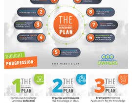
I need a flow chart or graphic (at your discretion) that is a professional looking graphic or info graphic that conveys thought progression though a continuous loop.

I would also like 9 individual graphics that emphasize each individual step (ie bold text, brighter colors etc) so that when I’m speaking on them, I can use that graphic.

I would like the graphic to be able to be printed a larger info-graphic type paper copy and post-able on social media.

Attached I have the 9 step plan and some graphics that I found and like to get you started.

Best graphic wins but if there are 2 I like I will not hesitate to pay for both. Winners will also be added to Rolodex for future design projects.

Recommended Skills

Employer Feedback

“Excellent communication and design skills. Original thoughts and presented me with an idea that I hadn't even considered that will work excellent. Would hire again. ”

Profile image Spar24, United States.

Top entries from this contest

View More Entries

Public Clarification Board

  • Diosmary
    Diosmary
    • 4 years ago

    can check now my entry #23

    • 4 years ago
  • Spar24
    Contest Holder
    • 4 years ago

    I'll try to clarify. I want The Professional Development Plan as the name in the center or top. Then I want the progression through steps 1-9 but you can denote progression via arrows etc or numbers. Each step can be portrayed by ANY shape but I want my bolded text to be emphasized some how. I would like to use colors that stimulate growth, thought and action. These would be lime/light greens, blues/purples and oranges/reds/yellows respectively. Once the first flow graphic is done I would like the individual steps to be broken out 1-9 so that I can have them stand alone in social media posts and in online classes. The best example so far of this is #'s 13/14 if you're looking for further clarification. I hope that helps everyone out! Thanks!! @ #9 and other freelancers.

    • 4 years ago
    1. mustafa8892
      mustafa8892
      • 4 years ago

      thank you for your clarification ,I tried to change the middle of the graph #19 you can check it now.

      • 4 years ago
  • Spar24
    Contest Holder
    • 4 years ago

    #16 I'm struggling to read the font on that tree and I'm not digging the random color choice this time.

    • 4 years ago
  • Spar24
    Contest Holder
    • 4 years ago

    #13 #14 I left you several comments just so you know

    • 4 years ago
  • Spar24
    Contest Holder
    • 4 years ago

    #12 The plan is called The Professional Development Plan and that can be in the middle with the 9 steps around. Otherwise the design isnt bad.

    • 4 years ago
  • FALL3N0005000
    FALL3N0005000
    • 4 years ago

    Hello sir check my entry #12 #18 i have change the color hope you like it .Thanks

    • 4 years ago
  • Spar24
    Contest Holder
    • 4 years ago

    #9 is better than the previous version but I still do not care for the middle design.

    • 4 years ago
    1. mustafa8892
      mustafa8892
      • 4 years ago

      we can put name of the graph in the middle of design ... almost you didn't like cubic and rectangular and circular graphs , so can you clarify your idea more little bit.. or show us some example that you really like. thank you

      • 4 years ago
  • Spar24
    Contest Holder
    • 4 years ago

    #10 / everyone the center could also just say The Professional Development Plan

    • 4 years ago
    1. Diosmary
      Diosmary
      • 4 years ago

      I will be contacting you

      • 4 years ago
  • Spar24
    Contest Holder
    • 4 years ago

    #10 While I don't like the design and color choice as much as say #7 (Want to concentrate on greens, blues oranges). HOWEVER #11 is exactly what I want as my 9 "other" slides. Something I can use independently in a course etc along with the main diagram. I would encourage you to try to redesign the color and graphic so the text is a little more prominent and the color/design is less distracting. Otherwise #11 just needs a corresponding color adjustment with whatever scheme you pick. Awesome submission.

    • 4 years ago
  • Spar24
    Contest Holder
    • 4 years ago

    #8 is a bit minimalist for what I'm looking for and I'm not digging the guy in the middle.

    • 4 years ago
  • Spar24
    Contest Holder
    • 4 years ago

    #4 I like the design and how it is broken into two parts. I would consider changing the emphasized words from white to colored and the colored to white/black and see what that looks like. Also I do not care for the arrows in the middle. Maybe a different idea graphic in the middle (light bulb or something? or I could see my logo there too. Anyways see what you can do with that feedback.

    • 4 years ago
    1. mustafa8892
      mustafa8892
      • 4 years ago

      thank you for feedback , light bulb is a good idea ,but we can put the name of the graph as well , so what is title of this graph?

      • 4 years ago
  • Spar24
    Contest Holder
    • 4 years ago

    #6 I like the colors a lot but I would like a clearer designation of the flow of thought through arrows, flow or numbers. #7 I find putting lots of text in colors makes it hard to read; also many of my audience are color blind so I try to limit a lot of words in color.

    • 4 years ago
  • Spar24
    Contest Holder
    • 4 years ago

    #1 I like the initial design but its a little plain for my taste. Also I would like to use colors that stimulate thought and action (yellows greens oranges and reds) and see if they grab attention better. It was a good first attempt though. #2 is just a little confusing to me and doesn't indicate good flow. #3 is not terrible but seems a little color random and I don't like that the 1 for the first step is floating out there. Keep up the good submissions guys.

    • 4 years ago
    1. mustafa8892
      mustafa8892
      • 4 years ago

      thank you for feedback )) you can check this #4

      • 4 years ago
    2. FALL3N0005000
      FALL3N0005000
      • 4 years ago

      Hello sir check my entry #6 #7 i have change the color hope you like it .Thanks

      • 4 years ago
  • mustafa8892
    mustafa8892
    • 4 years ago

    #3 #2 I hope you will like it ... if you need changes feel free to tell me ..you can print in any size you want and Resolution will stay great )))

    • 4 years ago
  • FALL3N0005000
    FALL3N0005000
    • 4 years ago

    Hello sir kindly check my entry #1 hope you like it and changes you need then tell me i can do it.thanks

    • 4 years ago

Show more comments

How to get started with contests

  • Post your contest

    Post Your Contest Quick and easy

  • Get tons of entries

    Get Tons of Entries From around the world

  • Award the best entry

    Award the best entry Download the files - Easy!

Post a Contest Now or Join us Today!