grupooma
Argentina

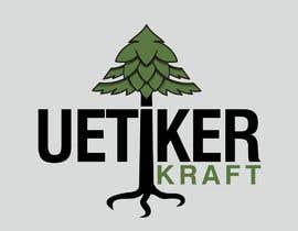
For a new craft beer brewery Uetiker Kraft, I am looking for help to create a pretty version of an initial logo design.
The initial design is a bit rough and I am looking for an optimized version:
- Font, now I used something basic
- Colors, for instance now there is a basic green. I am sure there are better shades to make it prettier. I do not want any screaming colors: so no neon green :-)
- A bit less old fashioned, for instance the leaves of the tree dont look very clean
- Do keep the tree overall as it is, must remain recognizable. It is part of the shield of the village after which the brewery is named
UPDATE: keep the tree as it is, it needs to be recognizable. Look at the rough design, so not the original village logo. I don't want the black circle and V, just the tree.
Let me know if you have any further questions.
Best regards, Alex
“Original ideas, easy and fast communication. Can strongly recommend working with Sebastian!”
![]() Lexer1980, Switzerland.
Lexer1980, Switzerland.

Post Your Contest Quick and easy

Get Tons of Entries From around the world

Award the best entry Download the files - Easy!
