Logo for MensHairCuts.com

  • Status: Closed
  • Prize: $100
  • Entries Received: 110
  • Winner: bappydesign

Contest Brief

We need a Logo design for website menshaircuts.com
The Logo has to be designed in social media style and plus for business docs (letters, business cards …).
Please:
- create the Logo on one line (icon left + name right)
- used white background
- do not show on business card
- do not use barbershop signs (we are the website - not an accessory shop or barbershop !!!!)
- do not use photo stock pictures
- do not add .COM
- all letters are preferably uppercase or you will offer something unusual
- see attachment!!!
- please check Public Clarification Board

First, you have to create for contest one picture.
If you a lucky winner, you have to create the full package (see description and pictures attached).
Final pictures must be in *.psd format.
Please see attachment!!!

The winner has to deliver next set of pictures.
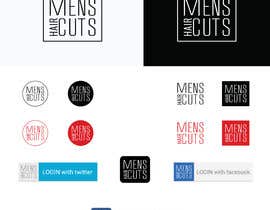
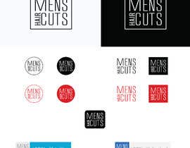
1. Social media package has included different type of shapes and colors. All numbers explained in the attachment
- clean sign (nothing around) in color (#7), black (#3), white
- sign in square color (#8), reverse color, black (#4), white
- sign in a square with rounded edges (#9) in color, black, white
- sign in circle color (#5), black (#1), white
- sign in circle color & white (#6), black & white(#2)
For white color – use the black background

2. Three buttons - color and white and black plus 1 reverse (see Google sample)

3. For business cards, folders, etc.

Please see attachment!!!

Ownership. (after the payment)
The Winner shall transfer and assign to Employer (Shurabor) all rights, titles, and interests throughout the world in and to any and all Work Product. This transfer and assignment include, but is not limited to, the right to publish, distribute, make derivative works of, edit, alter or otherwise use the Work Product in any way the Employer sees fit.

Recommended Skills

Employer Feedback

“Thank you for your work. I will order another project soon.”

Profile image Shurabor, Canada.

Top entries from this contest

View More Entries

Public Clarification Board

  • bor23
    bor23
    • 6 years ago

    Добрый день! Изменил шрифт и графические объекты - #119 и #118 . Буду благодарен за комментарий.

    • 6 years ago
    1. Shurabor
      Contest Holder
      • 6 years ago

      Уже теплее.
      Посмотри что то отсюда https://fonts.google.com/
      Соединить текст и лого очень трудно. поэтому разбей на две части.
      1 Лого как текст (он станет в шапке сайта). Есть идея например попробовать последнее слово CUT как бы срезать по косой и немного сдвинуть (не уверен что будет ОК). Сыграть толщиной MENS (bold)HAIRCUTS - но ???
      2 Иконка - которая будет использоваться для маркирования картинок и соц сетей. Твои иконки очень детальные - будет непонятно при ее уменьшении до 20х20

      • 6 years ago
    2. bor23
      bor23
      • 6 years ago

      Нарисовал по мотивам описанного Вами - #184 . Надеюсь понравится.

      • 6 years ago
  • AvishekM
    AvishekM
    • 6 years ago

    any further modification you want on #170 ? i'm always here...
    logo is in 5000x5000 pixel 300 dpi :)

    • 6 years ago
  • Aunonto
    Aunonto
    • 6 years ago

    Please check entry #174 #175

    • 6 years ago
  • makspaint
    makspaint
    • 6 years ago

    Logos in the rectangle is also one of them. Check

    http://www.gtdesigns.it/overusedlogos/

    • 6 years ago
    1. Shurabor
      Contest Holder
      • 6 years ago

      Thank you for the article!

      • 6 years ago
  • Shurabor
    Contest Holder
    • 6 years ago

    Hi guys. If you want to use the original font, we'll buy it if we approve your layout.

    • 6 years ago
  • bor23
    bor23
    • 6 years ago

    Hi! Please check my entry #106 . Thanks!

    • 6 years ago
  • AllGraphicsMaker
    AllGraphicsMaker
    • 6 years ago

    Boss please check #99 #100 #101 #102 #103

    • 6 years ago
  • Shurabor
    Contest Holder
    • 6 years ago

    Hello,
    Thank you for your Entries!
    Unfortunately, these are not what I'm looking for (as of entries #1-74). I can search Google too.
    First of all, I need Logo for my website - left top corner, white background. The space (hight) is limited and I asked to make Logo in one line - ikon+text, or you can separate icon and text. Logo as a text we will use directly on the web page and Ikon separate.
    One more time I asked:
    - do not use stock images (we checked all of them)
    - do not show logo on the business card,
    - do not show logo on the wall (we are not a store or barber shop),
    - try all letter in capital or small

    -

    • 6 years ago
  • divadmarketings
    divadmarketings
    • 6 years ago

    Sir Kindly check the Entry #57 please review it

    • 6 years ago
  • AllGraphicsMaker
    AllGraphicsMaker
    • 6 years ago

    check please #48 #49 #50

    • 6 years ago
  • ZozGalal
    ZozGalal
    • 6 years ago

    please check #33

    • 6 years ago
  • Shurabor
    Contest Holder
    • 6 years ago

    I asked in ONE LINE !!!

    • 6 years ago
    1. cooldesigner73
      cooldesigner73
      • 6 years ago

      avoid variations of the split logo format where the stalks of alphabets are used to break the name into parts , either as speech bubbles or as normal as these are all too common in innumerable contests.
      https://www.freelancer.com/contest/Design-a-Logo-for-an-App-Marketing-Agency-1193006.html
      https://www.freelancer.com/contest/Logo-Design-High-res-and-multiple-formats-1184455.html
      https://www.freelancer.com/contest/Create-a-Logo-for-my-site-1288135.html

      • 6 years ago
  • Shurabor
    Contest Holder
    • 6 years ago

    Do not add .COM

    • 6 years ago

Show more comments

How to get started with contests

  • Post your contest

    Post Your Contest Quick and easy

  • Get tons of entries

    Get Tons of Entries From around the world

  • Award the best entry

    Award the best entry Download the files - Easy!

Post a Contest Now or Join us Today!