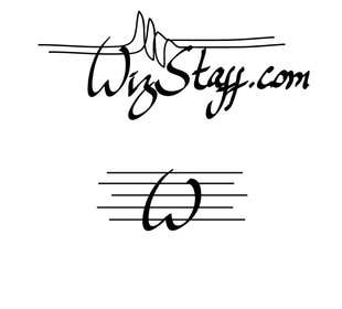
Logo for WizStaff
- Status: Closed
- Prize: $30
- Entries Received: 118
- Winner: Tareq017

Contest Brief
WizStaff.com is a home page for a symphonic music production software company.
I only need the logo.
Something simple.
Black on white or white on black.
This one looks close to what I want but the proportions are not pretty:
http://www.blingcheese.com/image/code/88/key+to+heart.htm
Also, I don't like f's insides and the circles at the ends are a bit too
heavy. Just a calligraphic font without any serifs at all might work better.
Attached are my own doodles with and without black circles at the end.
Ideally I'd like 3 logos: one with just letter W, one with word Wiz and 5 lines of the staff or the
conductor's stick and third one - the complete word WizStaff with or without .com in calligraphic font.
But either one will do for this price.
Additional notes after looking at first entries (thanks guys!):
- Also, the logo should be clear even if small size on the webpage.
- in WizStaff.com the letters W and S should be big and .com should be present
- elements of contour of a symphonic instrument could be used but not too much emphasized
- I'd like to keep letter z scripted 3-like shape.
- .com is really part of name, please keep the whole sord WizStaff.com in same style same size of letters and same "font".
- Another remark, that unlike the model on the picture, i want W look like W rather than V, and no need for 4 dots around it.
- Also, I don't need the music staff with notes on it - that'd be too banal.
Guys, please forget the initial mockup, the new .pdf is the precise concept I'm after.
I now prefer to keep it in my own hand writing, so no need to write anything for you.
If you could just make what I wrote look like a real logo, I'll pick that design, I guess.
Please nothing too fancy, I'm really determined to keep it simple.
Best regards!
Recommended Skills
Employer Feedback
“Tareq is a very professional worker, always in contact, delivered lots of resubmissions to my contest. Highly recommend!”
![]() svyatozar, Kazakhstan.
svyatozar, Kazakhstan.
Public Clarification Board
-

Contest Holder - 10 years ago
I wish to thank you all for participation: you all helped me to figure out what I needed.
I've awarded 2 entries: #156 and #25 and will combine the elements from both to create the final logos.
Congratulations to the winners, and good luck to the other participants!
Best regards,
-Alexandre Kharlamov- 10 years ago
-

Tareq017
- 10 years ago
Thanks
- 10 years ago
-

Magsinodan
- 10 years ago
Thank you.. Congrats to the winners ;)
- 10 years ago
-

manuel0827
- 10 years ago
was that a bluff?
- 10 years ago
-

DinuthShamen
- 10 years ago
Sir, hope you like entry # 152.. please let me know
- 10 years ago
-

john6185
- 10 years ago
Hello Sir. Hope you are well. I would appreciate if you could please give entry #154 a check. Thanks a lot.
- 10 years ago
-

jerson22
- 10 years ago
Sir, hope you like entry # 122.. please let me know
- 10 years ago
-
Contest Holder - 10 years ago
It is an interesting concept, but I don't like the font at all :-(
- 10 years ago
-
jerson22
- 10 years ago
thank you... let me make any correction..
.- 10 years ago
-

webhubsolution
- 10 years ago
sir please check our entry at #137
- 10 years ago
-
Tareq017
- 10 years ago
Sir Please check #131
- 10 years ago
-
Tareq017
- 10 years ago
#127 Check Please
- 10 years ago
-
Magsinodan
- 10 years ago
- 10 years ago
-

thenomobs
- 10 years ago
feedback #89 thankss
- 10 years ago
-

exxsambrano
- 10 years ago
Feedback on #100 . Thanks.
- 10 years ago
-

izzrayyannafiz
- 10 years ago
feedback on #99
- 10 years ago
-
manuel0827
- 10 years ago
What can you tell me about #16 Boss , how can I improve it other than adding .com
- 10 years ago
-
manuel0827
- 10 years ago
#95 #94 can I have your feedback Boss.
- 10 years ago
-

production347
- 10 years ago
Rate #74
- 10 years ago
-
webhubsolution
- 10 years ago
Sir please rate our entry number #71
- 10 years ago
-

mahadejaz
- 10 years ago
Hi, Please rate #57 . Thanks
- 10 years ago
-

jonydep
- 10 years ago
Dear SVYATOZAR,
#59 & #51 are expecting your feedback.........- 10 years ago
-
Contest Holder - 10 years ago
I clearly stated that I wanted a hand-written kind of z, the one in #64 is the kind of z i'm looking for!
- 10 years ago
-
Contest Holder - 10 years ago
Guys thanks a lot for your entries, so far the top is #5, but unfortunately without .com
#25 is my second place so far
Overall remarks that apply to most of the entries (including the top ones):
-I'd like to keep letter z scripted 3-like shape.
-.com is really part of name, please keep the whole sord WizStaff.com in same style same size of letters and same "font".
-Another remark, that unlike the model on the picture, i want W look like W rather than V, and no need for 4 dots around it.
-Also, I don't need the music staff with notes on it - that'd be too banal.- 10 years ago
-

Anuj33
- 10 years ago
Hello Sir,
Please check the entry # 21 with all the logos. Feedback for the logos will be welcomed.
Thank you,
Warm Regards,
Anuj- 10 years ago
-
Contest Holder - 10 years ago
Sorry, Anuj, but I clearly asked for 2 colors: black and white. I don't want the g clef on the logo because it's about Wiz staff, not a g-staff, get it? And your W looks ugly. What can I say. Thanks for the effort!
- 10 years ago
-
izzrayyannafiz
- 10 years ago
feedback on #25
- 10 years ago
-

khaqanaizad
- 10 years ago
- 10 years ago
-
manuel0827
- 10 years ago
#16 is this what you are looking for Boss?
- 10 years ago
-

asaadabbasi101
- 10 years ago
please rate #15
- 10 years ago
-
asaadabbasi101
- 10 years ago
please rate #14
- 10 years ago
How to get started with contests
-

Post Your Contest Quick and easy
-

Get Tons of Entries From around the world
-

Award the best entry Download the files - Easy!